We introduce how to use "Contact Form 7", a WordPress contact form plugin.
With "LIQUID PRESS" themes, forms can automatically be made responsive.
Applicable Themes
Installing the plugin
- Contact Form 7
- Or search for "Contact Form 7" from Admin screen > Plugins > Add New
*This does not guarantee the operation of the plugin.
How to use Contact Form 7
Creating a form
Configure the form from Admin screen > Contact > Add New.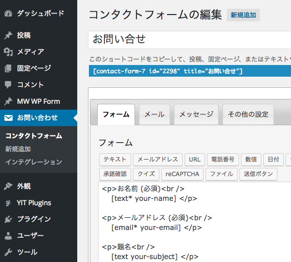
Entering form tags
Enter ordinary text for field labels and the like, and enter form tags enclosed in square brackets [] for the form controls.Form tags can be entered easily using the buttons on the form toolbar.
Example: text input
[text* your-name]
*For detailed usage and configuration instructions, please see the manual on the plugin's official site.
Usage | Contact Form 7 [Japanese] (official site)
Setting up email
From the Mail tab, edit the template for the emails that are sent.
You can retrieve the entered content by specifying the form field name in square brackets.
| Setting (example) | |
|---|---|
| To | [your-email] |
| From | info@example.com |
| Subject | [your-subject] |
| Additional headers | Reply-To: [info2@example.com] (reply-to address) Cc: [info3@example.com] (when specifying a CC) |
| Message body | Dear [your-name] [your-message] This email was sent automatically. |
| File attachments | [your-file] (when there is a file upload field) |
| Mail (2) | Using Mail (2), you can create another template. (For example, an email to the administrator and an automatic reply to the user.) |
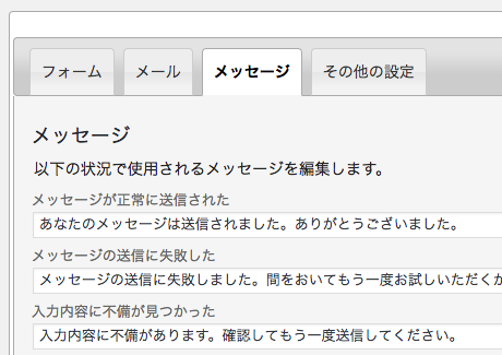
Setting up messages
From the Messages tab, edit the messages displayed on the form.
Creating the form page
From Admin screen > Pages > Add New, enter the shortcode of the form you created into the body.In addition, LIQUID PRESS supports shortcodes in widget areas as well, so you can also create the form as a widget.
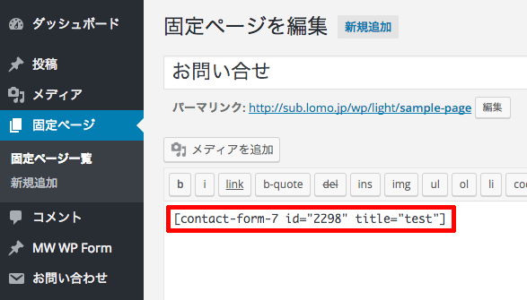 Your form is now complete.
Responsive support
With LIQUID PRESS series themes, forms automatically become responsive (smartphone-friendly).Thanks to responsive web design, they are displayed optimized for the device's screen size.
In addition, our original "RWD+" also enables switching between PC and smartphone display.
For details, please see theme features.
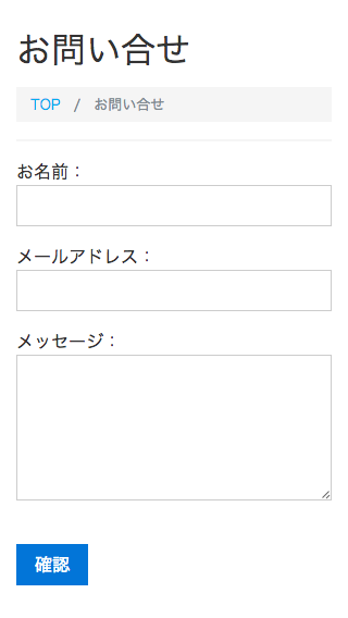 Smartphone display
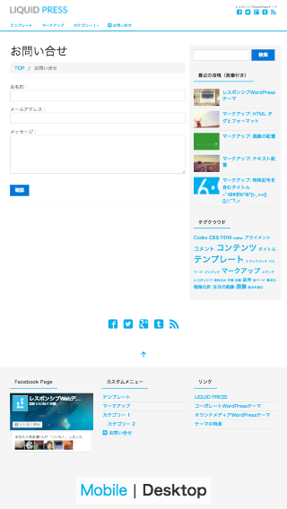 PC display on a smartphone
Users can switch between smartphone and PC display using the link in the footer.
The form's design also looks stylish, matching the theme.
Bootstrap support
Because Bootstrap5 is also supported, you can customize forms using its rich set of CSS components. Classes are added automatically to the form controls.LIQUID PRESS
 » Unlimited Plan
» All Themes
» Unlimited Plan
» All Themes