WordPress Block Style Design
LIQUID PRESS BLOCK STYLE DESIGN-
WordPress Block Style Design
New We have released the Block Pattern Gallery, ready to copy and paste!
LIQUID PRESS premium themes (Version 1.1.7 and later) support block style design. You can easily change the design with the WordPress block editor.
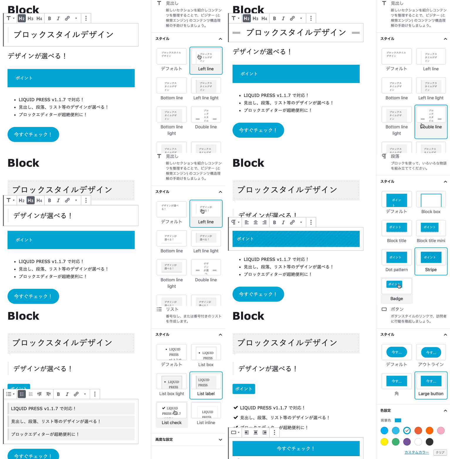
We have released the free Gutenberg block template plugin!
For conversational speech balloons, popup banners and the like, plugins are available.
For design changes, please also see our free design skins & parts.
How to use block styles
Select a supported block and choose a design from "Styles" in the sidebar.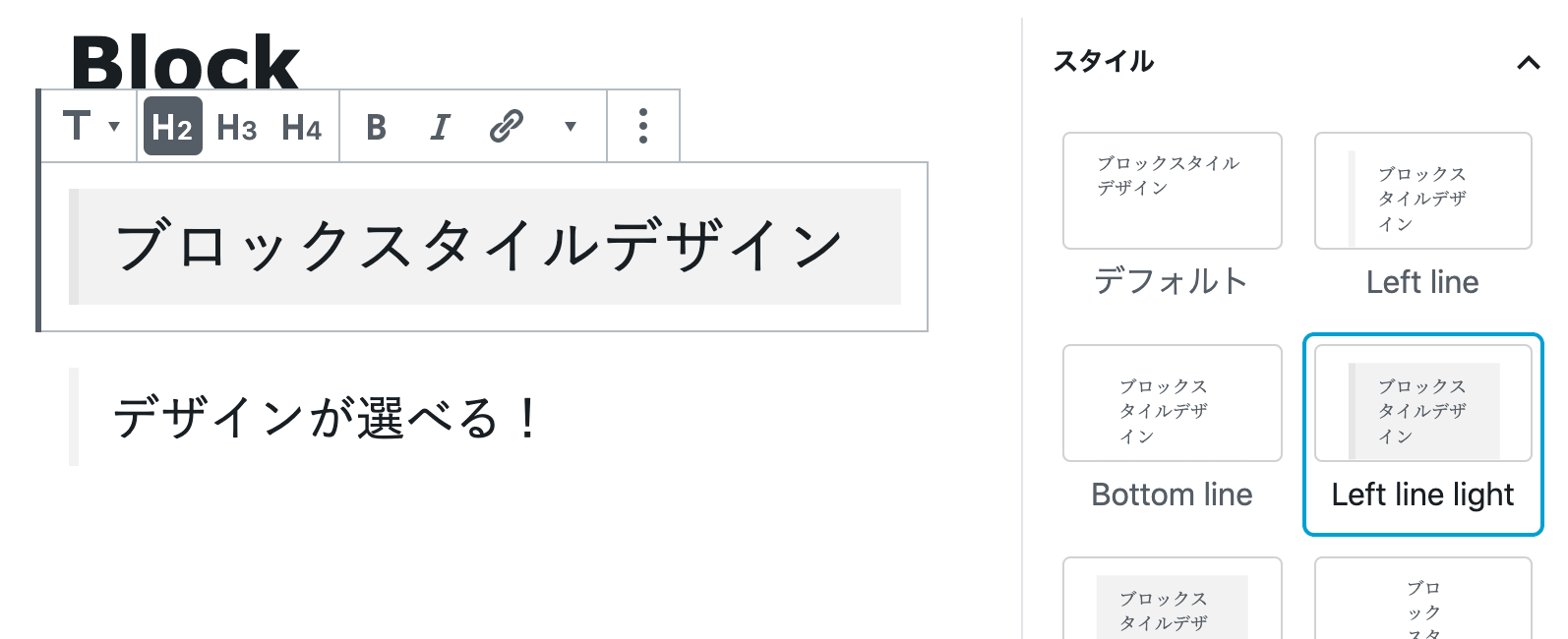 You can also select a style from the toolbar above the block.
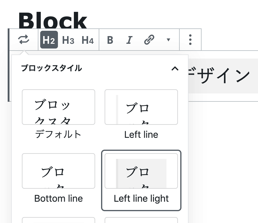
For how to use Gutenberg, please see this page.
Default style
If you select "Default style" from "Styles" in the sidebar, that style becomes the initial setting from then on, which is very convenient.Notes
* The Gutenberg block style feature depends on the core functionality of WordPress itself. Style specifications may change as a result of changes to the WordPress core. Please understand this in advance.
* Operation has been verified with WordPress 5.2.3. Behavior may differ with the Gutenberg plugin version. Please understand this in advance.
* If you experience problems with the Gutenberg editor, please see our FAQ. -
Paragraph
Styles: Dots, Stripes, Block title, Block box, Badge, Step
These are designs for the paragraph block. By configuring the background color, text color, font size and so on, you can create a wide variety of design variations. We recommend using the block title in combination with the block box and similar styles.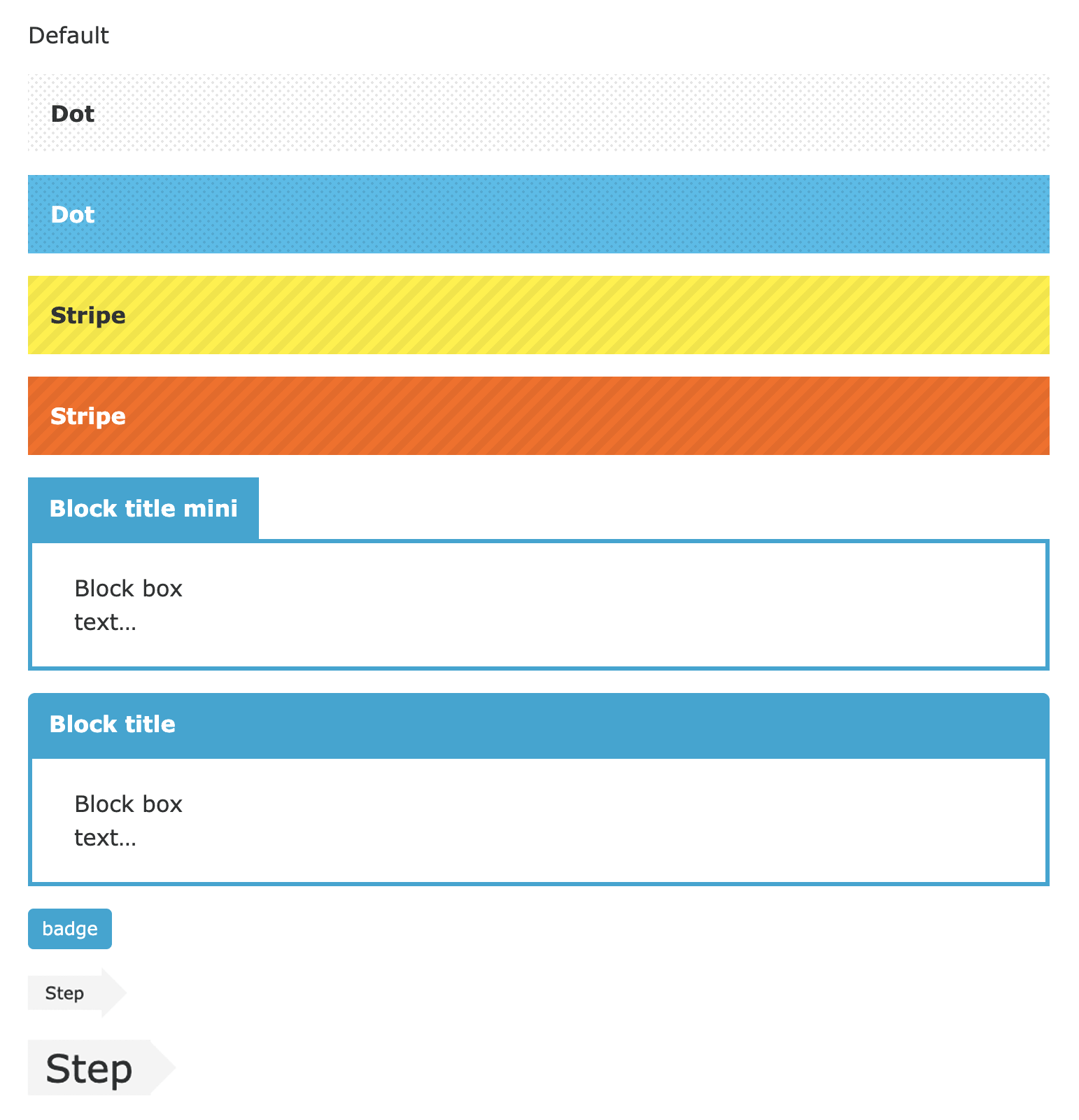 * The block title appears as shown below on the editing screen, but this is not a problem.
* For the block box, the background color becomes the frame color.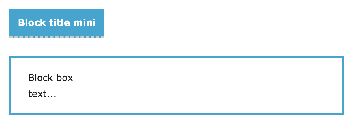
-
Heading
Styles: Left line, Underline, Left line light, Underline light, Double line, Balloon, Ribbon, Dots, Stripes, Step
These are designs for the heading block. Color settings are supported.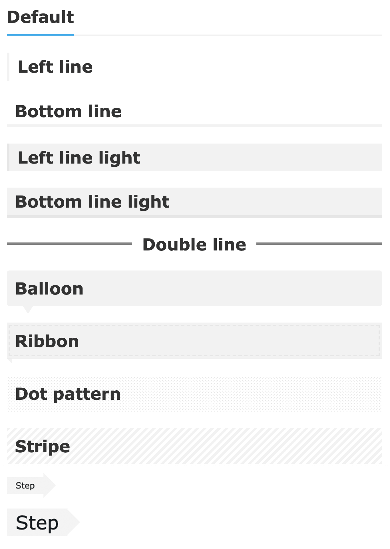
-
List
Styles: List box, List box light, List label, List check, List inline
These are designs for the list block. With list inline, you can create items arranged side by side.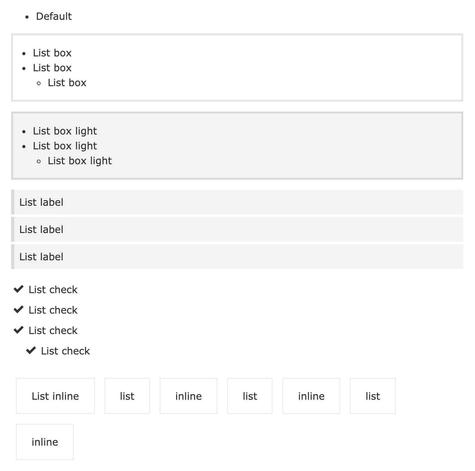
-
Columns
Style: Column slider
This is a design for the columns block. You can make the content slide column by column. Any block can be freely inserted inside a column. By combining headings, images, covers, paragraphs and more to suit your purpose, you can create an original slider. It is responsive, and you can also slide by pressing the arrows.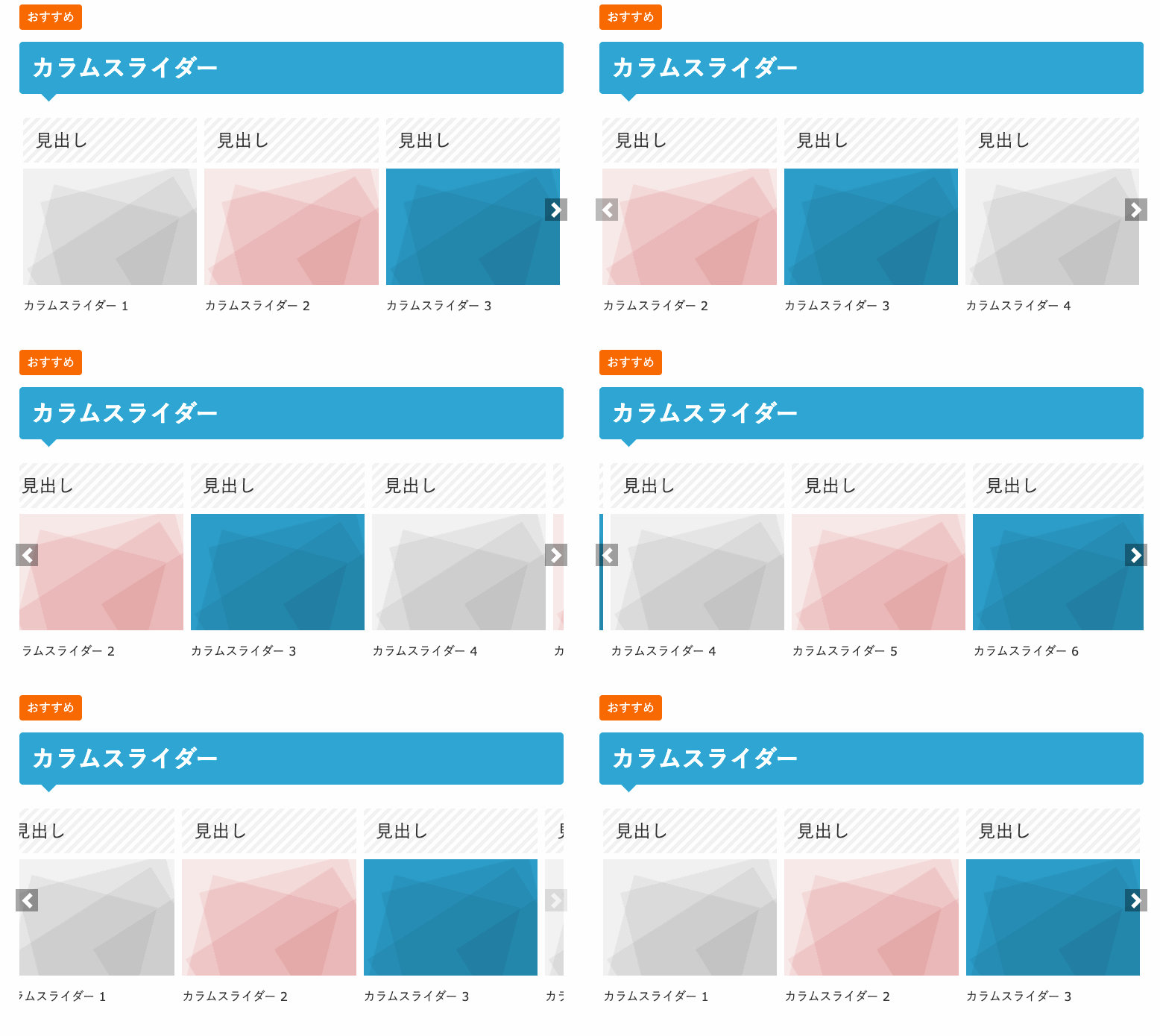 The number of columns / number displayed (from 1 to 10) and automatic/manual scrolling can be configured.
On the editing screen you can configure it with horizontal scrolling.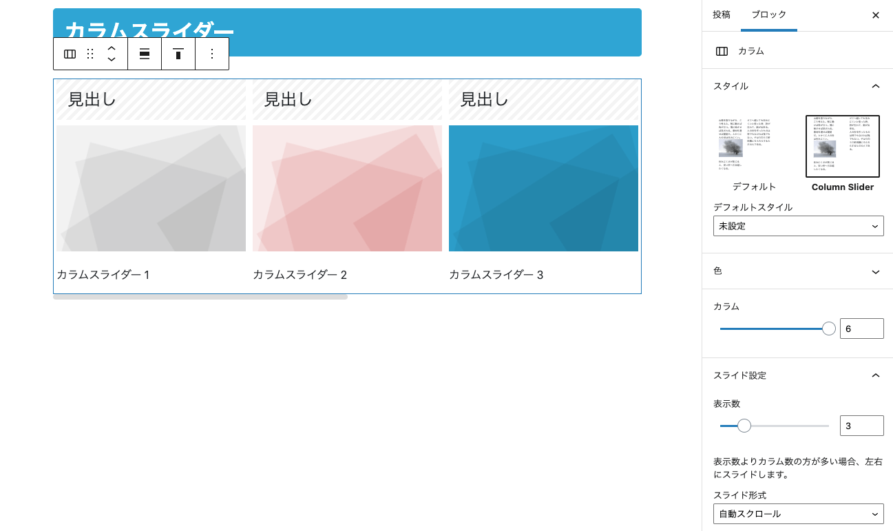
-
Gallery
Style: Fade slider
This is a design for the gallery block. You can create a gallery that switches automatically with a fade effect. It is responsive, and you can also switch images by pressing the arrows.
On the editing screen you can configure it with horizontal scrolling.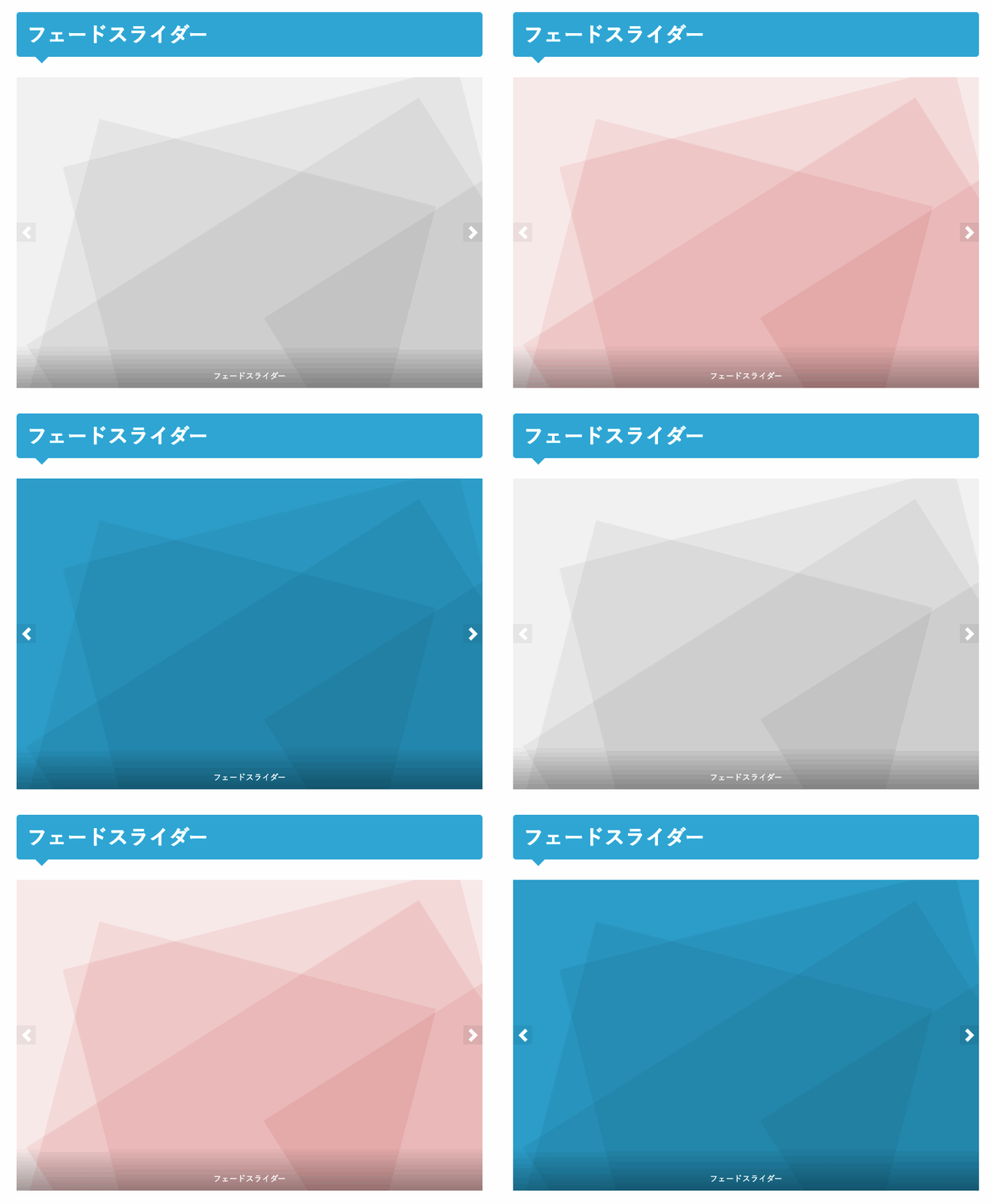
Style: Mini slider
With the mini slider, you can create a horizontally scrolling gallery. It becomes a responsive slider according to the number of columns. It is a manual scrolling slider.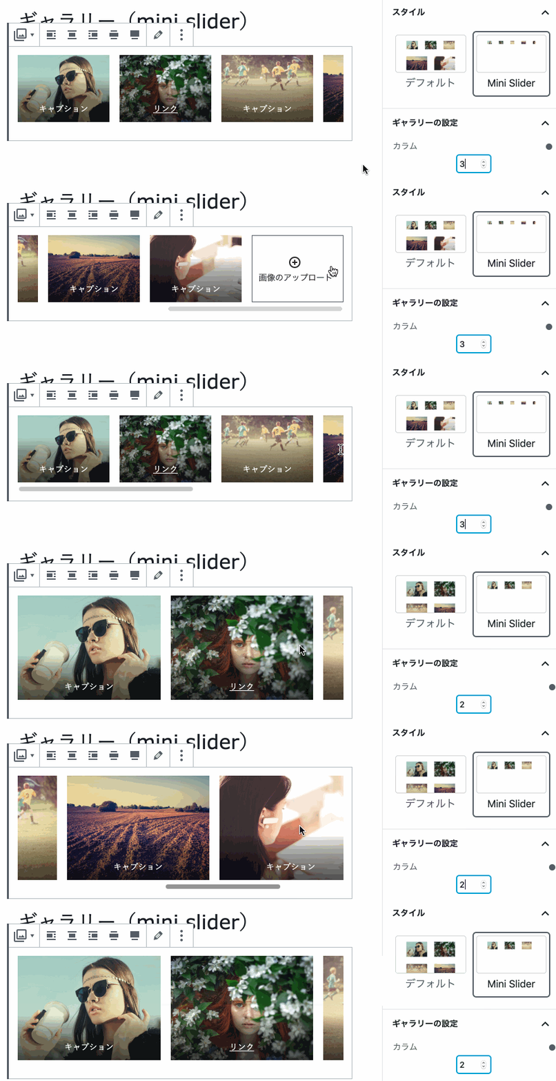
-
Quote
Styles: Quote box, Quote box light
These are designs for the quote block.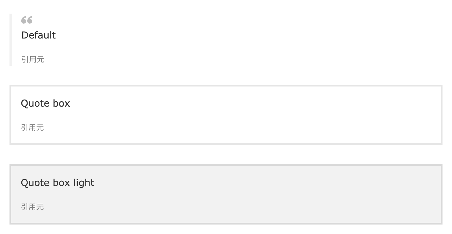
-
Button
Style: Large button
This is a design for the button block. With the large button, you can create a full-width button. Color settings are supported.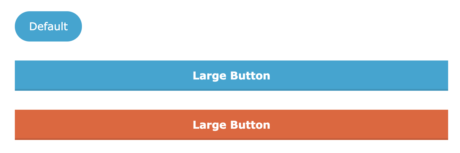
-
Separator
Style: Down arrow
This is a design for the separator block. It is recommended for separating vertically arranged items. Color settings are supported.
-
Table
Styles: Stripes, No border
These are designs for the table block. The default has borders. -
Code
Style: Dark
This is a design for the code block. It gives you a dark-colored design.
LIQUID PRESS is committed to advancing support for the WordPress block editor.
[Requests welcome] If there is a design you would like to see, please tweet us here!